-
Mar 11, 2015, 04:01 AM
#1
Member


On the Heels of my Last thrilling thread ....
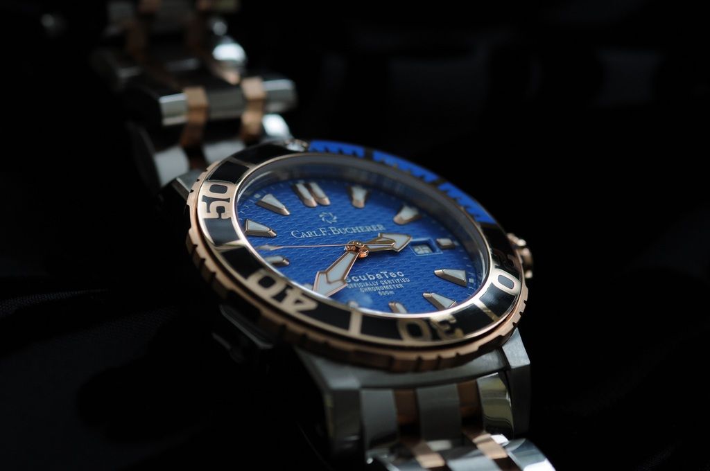
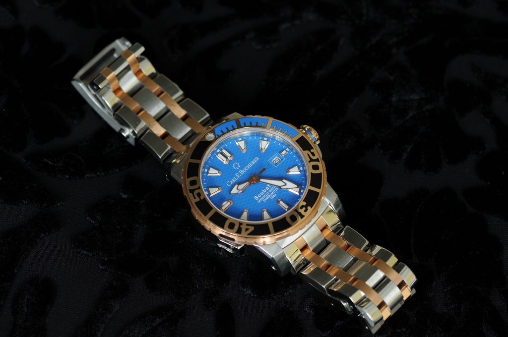
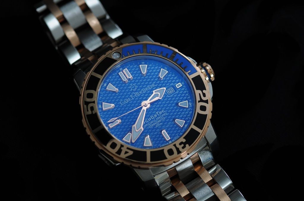
Comes another recent acquisition. I know a lot of folks don't go for steel and gold, and I understand that. I will say that I think gold looks inappropriate until you hit 50 or so. I pass that test. For me, this watch is about as dressy as I can go, and in the short time I've owned it I would put it in the category of a watch I would be happy to never take off. I've met few watches I can say that about. I like its bold styling, which is right up my alley, but its not too over the top.
I think its a bit pricey considering the movement is an ETA 2892 ($1,600 less than the two tone Submariner). But it does offer a fresh, bold iteration of a serious dive watch and there is some complexity to the case and bracelet that ups the manufacturing costs a bit. The bezel is ceramic. Oh, and Bucherer custom made me a full lume filled hour hand instead of the stock skeleton hour hand with lume only at the tip.
The Carl F. Bucherer two tone Patravi ScubaTec -
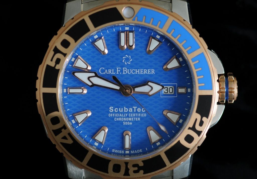
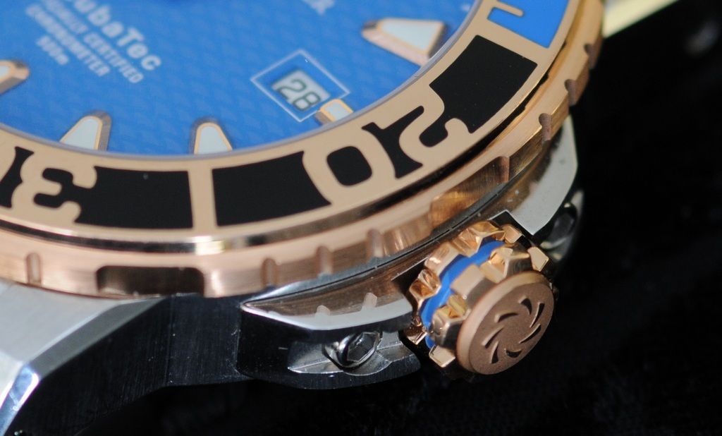
There is a fair amount of work on the crown and crown guard. The crown has polished, painted and sandblasted surfaces.
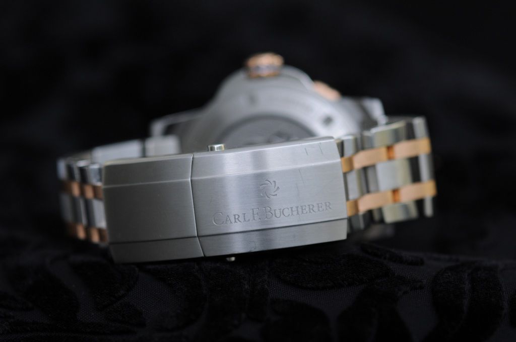
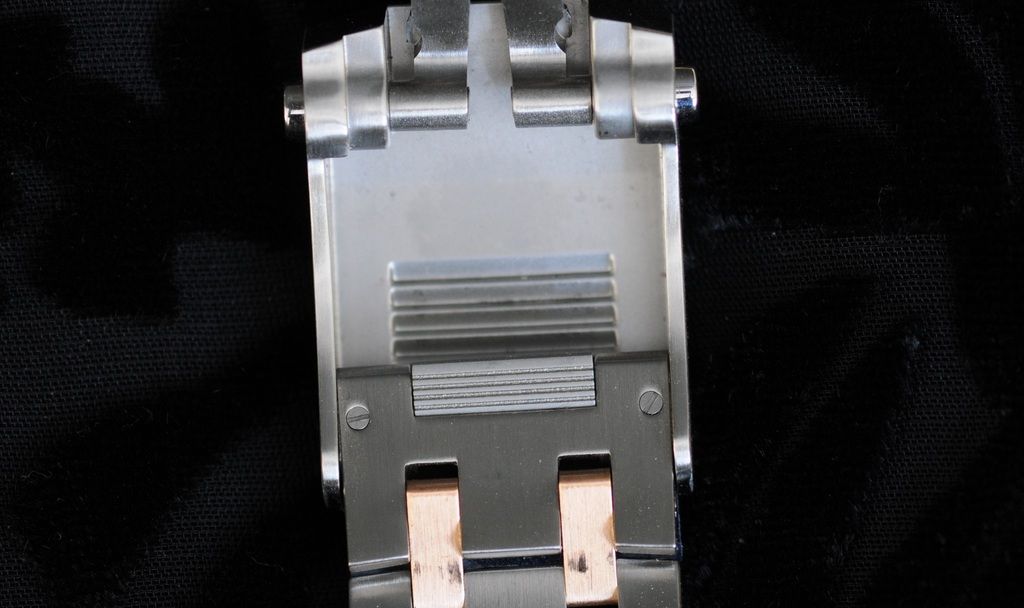
The buckle is impressive. It is very comfortable in spite of its massive size, and it incorporates an effective no tools on-the-fly micro adjustment.
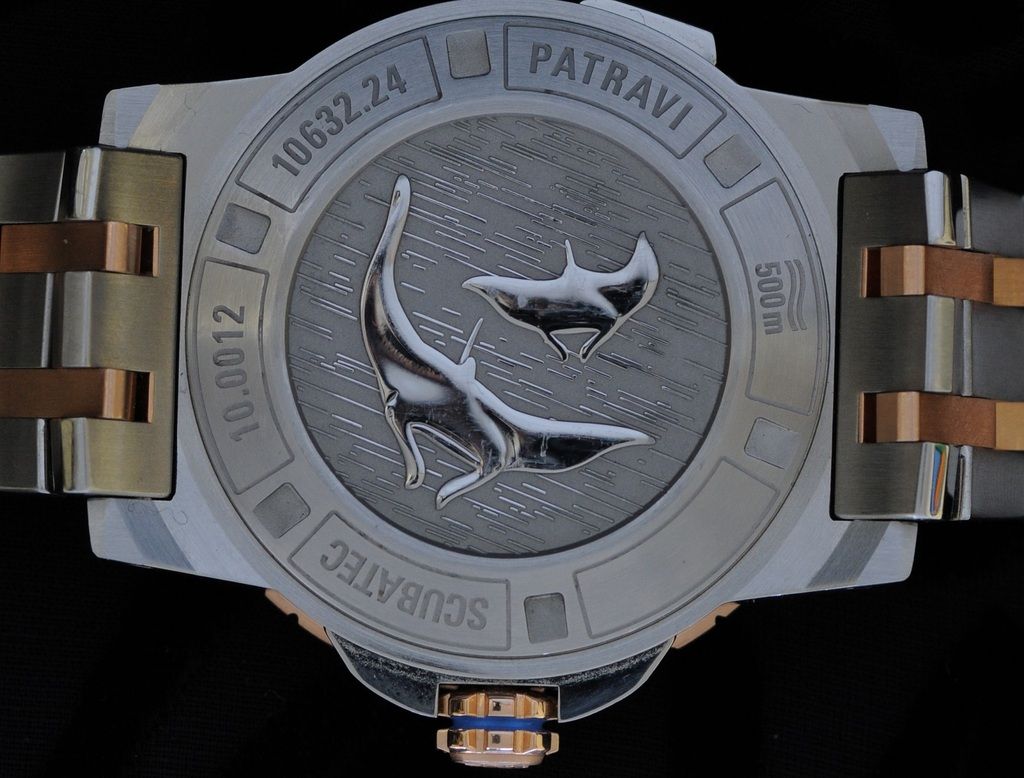
And the back is fun...
Last edited by Gary123; Mar 11, 2015 at 04:08 AM.
-
Post Thanks / Like - 15 Likes
 M. Montaigne
,
popoki nui,
geoffbot,
stewham,
FuzzyB,
Upstate,
Banker,
Rdenney,
Bwana,
synequano,
Hayseed Brown,
Colin,
iyonk,
MHe225,
tempocalypse liked this post
-
Mar 11, 2015, 04:07 AM
#2
Member


This watch really holds my attention. Nice!
-
Post Thanks / Like - 1 Likes
-
Mar 11, 2015, 04:10 AM
#3
Not too fond of the bracelet but I dig the dial and bezel. That is a hypnotic shade of blue. Enjoy!
-hayday
Once in awhile you get shown the light in the strangest of places if you look at it right.
-
Mar 11, 2015, 04:30 AM
#4
Nice pickup.I don't care for the gold but otherwise it's
 .I would get that on some shoes.
People sleep peaceably in their beds @ night ONLY because rough men stand ready to do VIOLENCE
on their behalf.....
William
Member#842
-
Mar 11, 2015, 04:35 AM
#5
Original Gangsta


Striking watch.
Not something I would wear, but then I also think the Submariner is a passable watch, so there's no accounting for poor taste (on my end, that is).
-
Mar 11, 2015, 04:39 AM
#6
I can wear SS+gold after age 50? You should have told me this 18 years ago!
Now I know that the Ebel 134 headed my way from Hungary will pass the "appropriateness test".
90% of my watches are gold - of course, they mostly live in my pocket. [geezer alert!]
La lutte elle-même vers les sommets suffit à remplir un cœur d'homme; il faut imaginer Sisyphe heureux.
-
Post Thanks / Like - 1 Likes
-
Mar 11, 2015, 04:52 AM
#7
That is a striking watch.
Also I will honestly say that is first two tone watch I can say that I have liked the looks of.
Sent from my iPhone using Tapatalk
-
Mar 11, 2015, 05:07 AM
#8
Lovely shade of blue .
Personally I don't have a problem with eta movements in more expensive watches. Certainty an advantage come service time.
MB2, SOH, Aquascope, Tangente, MM300, Blackbay, North Flag, Officer, Visitor.
-
Post Thanks / Like - 2 Likes
-
Mar 11, 2015, 05:31 AM
#9
The only thing I don't like on this watch is the big font on the bezel. Otherwise....I really really like this version. Congrats!
~Sherry.
Eterna | Tudor | Seiko | Casio | G-Shock | Orient | Swatch | Mondaine | Zodiac (pre-Fossil) | Rolex | Wenger | Pulsar Time Computer | Omega | Timex | Bucherer | Citizen | Bulova | Glycine
-
Mar 11, 2015, 05:44 AM
#10

Originally Posted by
popoki nui

The only thing I don't like on this watch is the big font on the bezel. Otherwise....I really really like this version. Congrats!
~Sherry.
I really dislike the giant bezel font, sadly I find it the best feature on this watch 


 Likes:


 Reply With Quote


