-
Feb 14, 2016, 04:05 AM
#31

Originally Posted by
CFR

And obviously, I'm late. Sorry, Henry.

Magnificent photography, as always, of a great combo. I like the watch, like the strap and like the final result...a lot!
Congratulations Henry and kudos to Iyonk for another great strap.

Cheers,
C
Thank you C.
-
Feb 14, 2016, 08:44 PM
#32

Originally Posted by
Henry Krinkle

Light does still bounce around in them and they can still be quite glarey. Underexposing does help quite a bit.
I hate to hijack the thread, but I'm curious about the "underexpose". How much post-processing do you do? I can imagine several reasons for underexposing, but I'd like to hear you reasons (other than "it works"). Now that you mention it, I may try something *similar* - I think I have to pay more attention to where the highlights are. Perhaps that's what you are doing?
My current *guess* is that underexposing by 1 or 2 stops works because many of the interesting details in watch photos are in the highlights.
La lutte elle-même vers les sommets suffit à remplir un cur d'homme; il faut imaginer Sisyphe heureux.
-
Feb 14, 2016, 10:44 PM
#33

Originally Posted by
KennethRSloan

I hate to hijack the thread, but I'm curious about the "underexpose". How much post-processing do you do? I can imagine several reasons for underexposing, but I'd like to hear you reasons (other than "it works"). Now that you mention it, I may try something *similar* - I think I have to pay more attention to where the highlights are. Perhaps that's what you are doing?
My current *guess* is that underexposing by 1 or 2 stops works because many of the interesting details in watch photos are in the highlights.
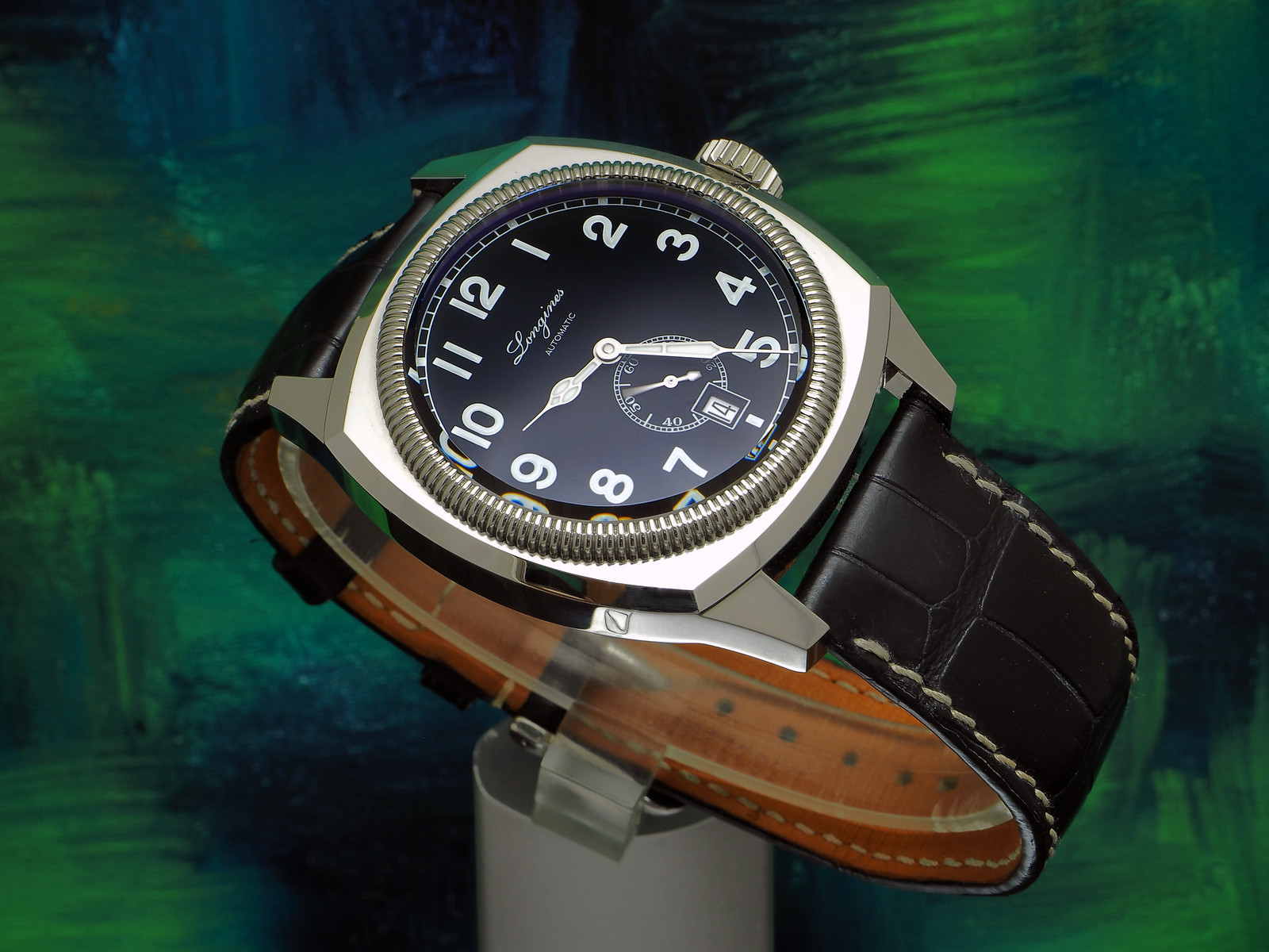
You are more or less correct. I pay a lot of attention to the highlights. I think steel looks pretty good when it is a bit dark anyway, so keeping a bit of detail in the brightest part is usually my goal. The cathedral hands on my Longines Heritage 1935 are a perfect example. I am generally trying to pick up that thin line between the metal and the lume of the hand. I have added a photo of each point even though I doubt that you need them.
 P2140408 by Hank Blanc, on Flickr
As I wrote to Kody, I am pretty careful about light position too. I often want to capture play off the hands or markers. If you can make a couple of markers and maybe one hand pick up the light more than the rest it creates a lot interest and depth.
 PC110437 by Hank Blanc, on Flickr
I almost always do at least a bit of processing in Olympus Viewer. I am a pretty big fan of the highlight and shadow control. I also often fiddle with the gamma a little bit. I usually do this when I want to increase saturation. I prefer the density that a gamma adjustment does versus the look of simply adding more colour that one gets with a saturation adjustment.
 P1250174 by Hank Blanc, on Flickr
This last photo covers all three aspects, but nudging the gamma down is what makes this picture for me. Turning the saturation up makes the gold look like yellow gold, whereas the gamma control keeps the rose gold tones of the gold more accurately and increases the density on everything.
Last but not least, 25 years of exposure to solvent based printing inks made me a little light sensitive (they do that) and even though that passed when I switched my shop to UV inks I grew to like things a bit dark.
Last edited by Henry Krinkle; Feb 14, 2016 at 10:57 PM.
-
Post Thanks / Like - 5 Likes
-
Feb 15, 2016, 11:56 PM
#34
So, the short answer is: "expose to the left"?
I've spent a lifetime exposing to the right, which usually gives you the same options in post. But, generic metering exposes for the middle
I usually am satisfied with 3-zone post processing (0, 50, 100), and usually expand the range so a small percentage is cropped on either end - but every so often my initial exposure is too high. Time to start paying more attention to the highlights.
Thanks for making me think about this!
La lutte elle-même vers les sommets suffit à remplir un cur d'homme; il faut imaginer Sisyphe heureux.
-
Post Thanks / Like - 1 Likes
 Likes: 90
P2140408 by Hank Blanc, on Flickr
PC110437 by Hank Blanc, on Flickr
P1250174 by Hank Blanc, on Flickr
 Henry Krinkle liked this post